Summer is almost over. What better time to add some wrestling math to your summer reading list?
It is time to reveal the 2027 NCAA Expected Points Model. As in years past I use historical NCAA Tournament results by seed to build a model for predicting future results. In addition to total expected points I will also break them down by expected advancement, expected bonus, and expected placement points. Finally, there is a section for the probability of discrete placement by seed.
Fits Like A Glove
Nerdy Section
There are two versions of all of these numbers. There are the raw values and the fitted values. For this exercise I will use the fitted values.
To come up with the fitted values I made a few changes this year. The big one is that I shortened the lookback period – which seems an odd choice. In the past I used ten years worth of data, but that meant I had to span part of the 16 seed era and all of the 33 seed era – with the ratio shifting each year. That was a little problematic and led to an occasional weird outcome.
Now that there are seven years of tournaments with 33 seeds (though two weights had 32) I made the decision to use only those seven years. My reasoning is that 70 results per seed was just enough to make a better model than 100 results for the first 16 seeds and 70 results for the last 17 seeds. Given the fixed nature of the 33 seed bracket versus the partially variable nature of the 16 seed bracket, the change is justified.
The second choice I made was to fix a small past mistake. As I mentioned, there were two occasions in the past seven years where there were only 32 wrestlers in a bracket. This removed the pigtail rounds and caused the model to modestly undervalue the 32 and 33 seeds. That is no longer the case.
Finally, I tweaked some of the models. For the points fitting I fit seeds 1 through 31 separate from seeds 32 and 33 to account for the free advancement point in the championship pigtail and the 50% chance of a half advancement point in the consolation pigtail, as well as bonus point opportunities in both. I also played around with different types of models until I found ones that best satisfied a whole bunch of constraints. For the probabilities, which have to satisfy two constraints at once (the sum of seed probabilities must equal 1 and the sum of placement probabilities must equal 1 for the AA places, 4 for the blood round and round of 16 places, 8 for the round of for the round of 24 places and 9 for the other places) I used the same raking process as in years past.
Curvalicious
Pretty Picture Section
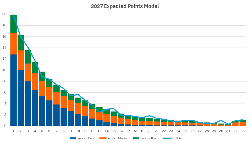
Let’s start with the headline numbers – Expected Points.
The fitting process takes some of the kinks out of the raw data. But that may be a mistake. Perhaps the drop at the 5 seed, the 9 seed, and the 13 seed are features of the data rather than bugs. Given that the tournament is structured to have 11 unique exit points and those three seeds line up with major exit points maybe it is a mistake to smooth them out. It is something I will keep an eye on as the data set grows.
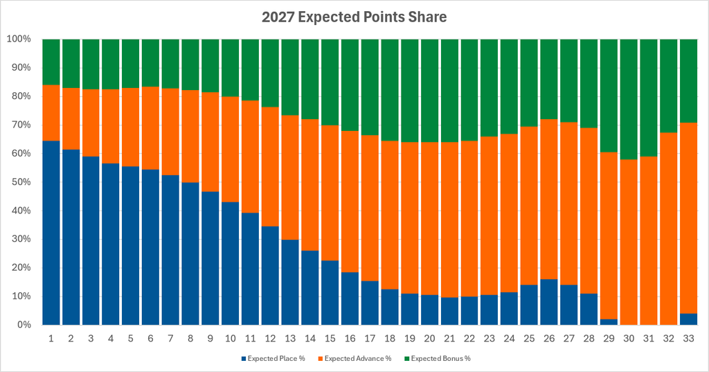
This next one is a new favorite. It takes the above data and looks at the relative contribution of each scoring category to the whole. Wavy lines are mezmerizing.
The way to read it is for a 1 seed approximately 65% of their points come from placement, 20% from advancement and 15% from bonus. This is not new information, but it formalizes what we already knew in an attractive way.
On to Probability of Placement.
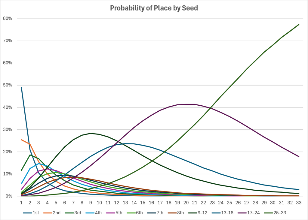
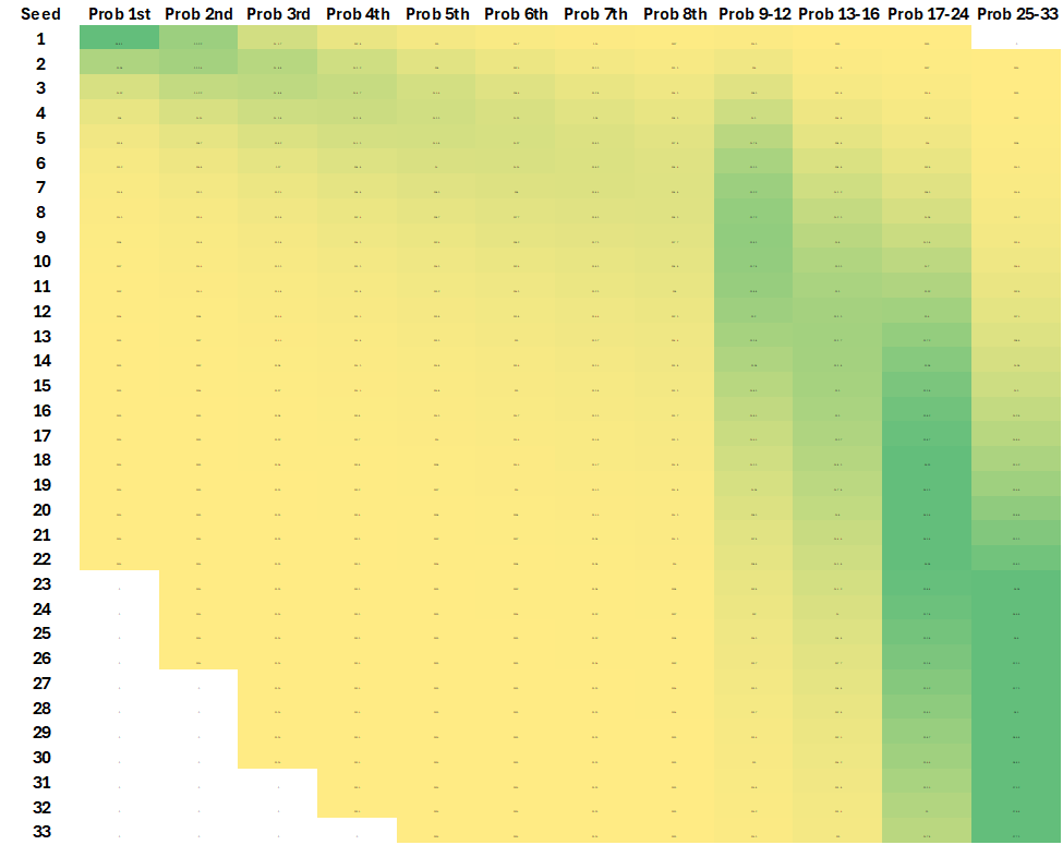
These next three graphics are an attempt to take a matrix of data and represent it as a graph and as a color coded map.
In the graph the lines represent the placement category. The x-axis are the seeds. For first place (dark blue line) the 1 seed has a 49% chance of finishing first, the 2 seed has a 21% chance and the 3 seed has an 11%. Each of these lines sums to 100% per placement – they just do it in very different ways.1
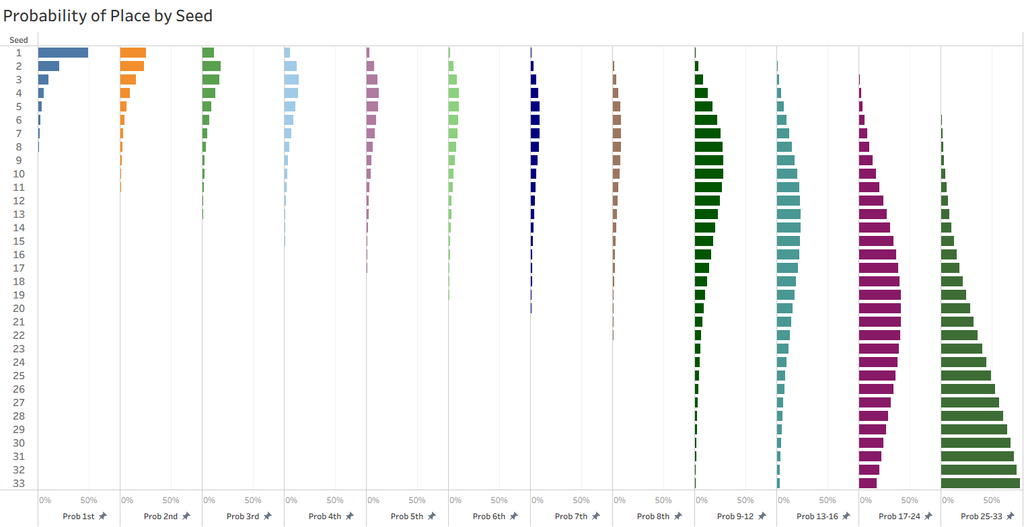
This is the same graph just turned on its side and pulled apart.
Finally, we have a color coded map with the depth of color corresponding to the probability of placement. I guess this isn’t really a curve, but I like it.
All-American Heroes
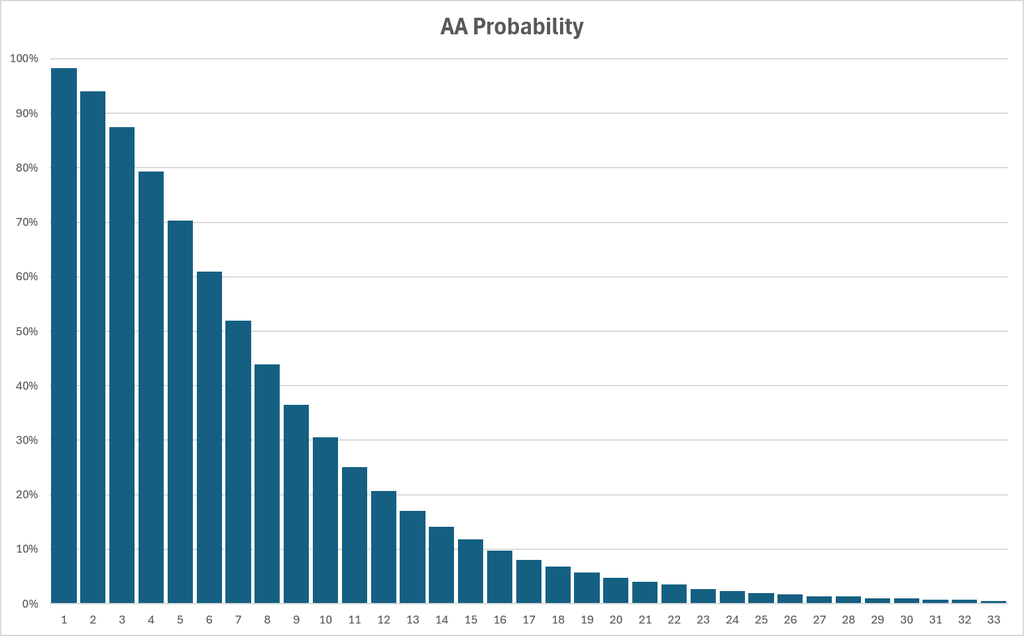
By aggregating the top eight placement probabilities we arrive at the All-American probabilities.
Assembling the Puzzle
All of these graphs are smoother than in years past. As mentioned earlier, perhaps there is a little over-fitting going on. If that is the case it will become more noticeable with more time and more data. Something to keep an eye on.
Once pre-season rankings come out I can use this data to project expected points, number of All-Americans, and probability of placement by category. I know that goes against every fan’s preferred way of doing this – assume the best case for every wrestler on the roster and end up with projecting 10 champions and 50 bonus point matches – but I do what I do.
As I have noted in the past this method is superior to those used by others in a couple of ways. First is the inclusion of bonus points. Bonus points are 15-20% of the total for All-American level wrestlers, and as much as 42% of the total for non-placers. Excluding them from any estimate of team scores is a big miss. Next, by replacing a binary placement model (every wrestler finishes exactly where they are ranked/seed) with an expectations model the problem of overvaluing top eight wrestlers and undervaluing everyone else is solved.
- Some lines represent more than one placement. For example, 9 – 12 represents four places so that line sums to 400%, or 100% per place. ↩︎
Comment below
email me at wrestleknownothing@gmail.com
follow me at wrestleknownothing.bsky.social
One response to “2027 NCAA Expected Points Model”
Cheers Brother.
The sight looks great gentlemen.